
As detailed in our recent article asking How Much Assessment is Enough?, research across UK research-intensive universities by Tomas & Jessop (2019) suggests that reducing the volume of assessment and the variety of assessment types can help reduce load and positively influence the way students approach learning. The analysis of our own assessment data presented in that article shows the volume and variety of assessment at Sydney, including the timing of deadlines and the variety in the assessments for some first year courses as illustrated by the figures at the bottom of this article, As noted there, assessment load and timing have a direct effect on special consideration applications, on-time submissions and on grades, with the best outcomes occurring when students have deadlines that are about a week apart. The detrimental effect of closer deadlines presumably reflects workloads and associated stress. The effect of more spaced out deadlines was perhaps surprising, but could reflect how assessment drives engagement. The article also presented views on the variety of assessment types are students are set for some first year courses. Requiring students to simultaneously master different genres will certainly add to the perceived load and, equally, an over-reliance on certain modes, such as written assignments or exams, may steer them to adopt narrow approaches to learning.
Given the complexity of our assessment and enrolment patterns, it is important to try to understand the volume and variety of assessment that students in our units are faced with. This understanding can be used by unit coordinators to collaboratively plan assessment approaches across programmes (such as degree components such as majors or first year) as well as by all educators to improve student outcomes and wellbeing. In this article, we describe a simple desktop exercise using data available to all staff at Sydney to help understand the assessment load for the student in our units. A similar exercise can also be used by students to similarly understand and plan their own assessment workload.
Data sources
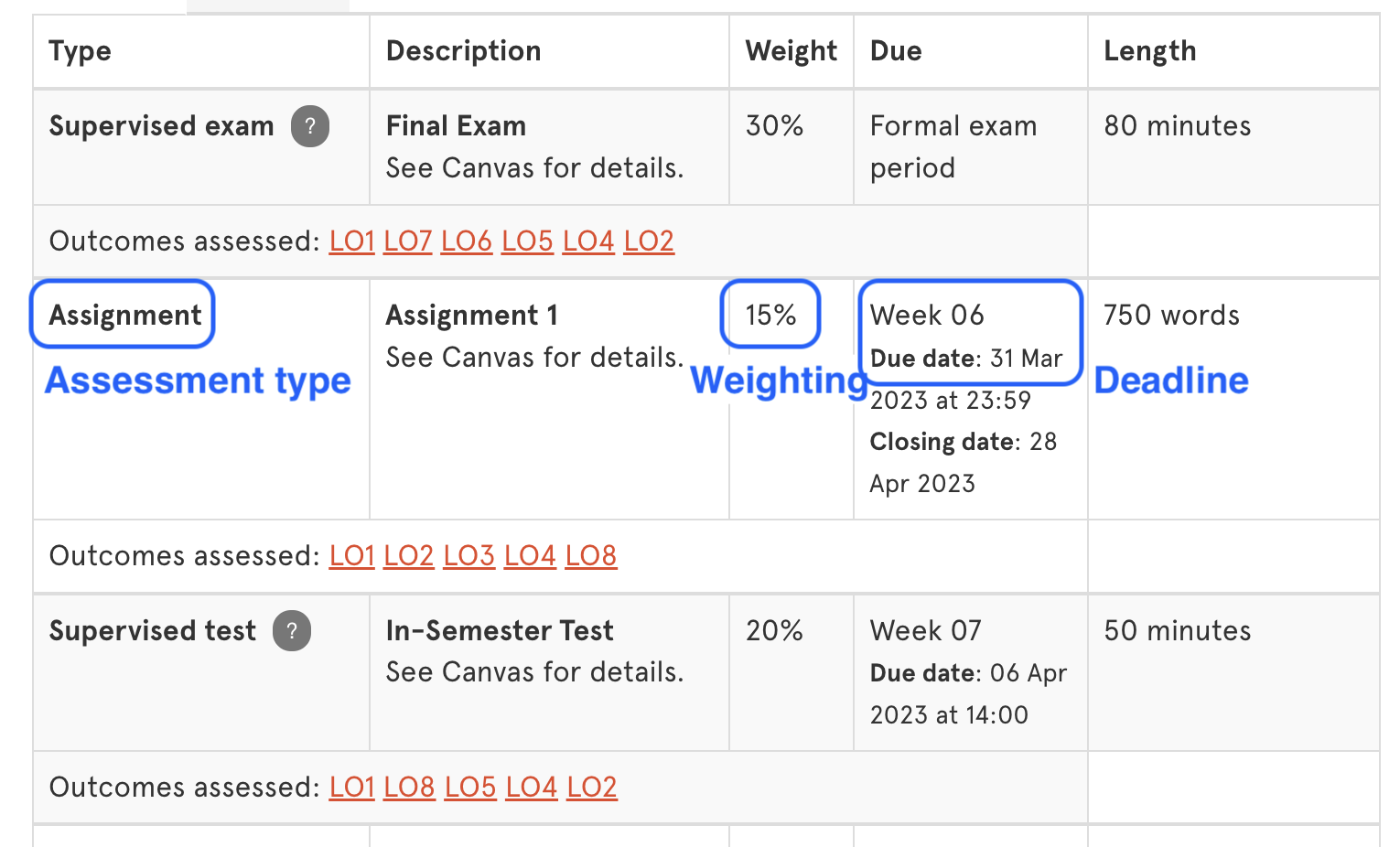
(a) Unit outlines
The assessment table in unit outlines contains for each assessment (i) the assessment types, (ii) the weighting and (iii) when the assessment is due. An example is shown in Figure 1(a) below. The categories and types of assessment available are described in the recent article Assessment in 2023.
(b) Knowing Your Students
The Knowing Your Students (KYS)
report contains a lot of annoymised information about the backgrounds of the students in each unit of study. One of the most important pieces of information on KYS is the list of the other units that students in the unit you are coordinating or teaching into are also enrolled in. After searching for the unit and semester you are interested in using the menu, the bar chart shown in Figure 1(b) will appear in the bottom right hand corner of the report. Only the top 4 units are displayed so hover over the chart and then click on the three dots that will appear in the corner to view the data as a table.

To understand the assessment load for your students, you can now read through the assessment table, and associated assessment descriptions, for each the other units your students are enrolled in on their unit outlines. If your unit is in a single degree with few electives, this list might be quite short. If your unit is an elective in several degrees, you might look at the top 4-6 units that your students are also taking.
Charting assessment workload
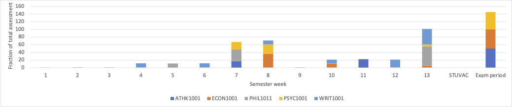
(a) Assessment volume
A simple way of visualising assessment volume in the chart in Figure 2(a) below, which shows the weighting of assessment for a student studying a combination of units for each week of the semester. It is fairly straightforward to produce such a plot with the set of units being your own plus the units which your students are commonly enrolled in using the data sources explored above. First, download a ready-made Excel spreadsheet. The first tab contains a completed version for the example unit ATHK1001 Analytical Thinking using the 2023 unit outline and KYS report. Use the second tab for your unit and start by entering the weighting for each assessment task in the first row of the table – e.g. if there’s a 20% assignment in week 4, put “20” in the week 4 column. If a task occurs over multiple weeks, divide the total up by the number of weeks and add each number to the appropriate week. As you do this, the chart will begin to appear. Once you have entered the data for your unit, repeat the task for the other units using their outlines for the details.
(b) Assessment variety
A similar activity can be used to picture the assessment variety, as shown in Figure 2(b). Using the second table in the same spreadsheet and the same set of units, now use their outlines to enter the weighting available for each assessment type. Again, the first tab in the spreadsheet has this completed for ATHK1001. In the other tab, start with your unit and enter the weighting for each type – e.g. if there are two assignments worth 10% and 20%, enter “30” in the assignment row. Again the chart will begin to appear as the data is entered.
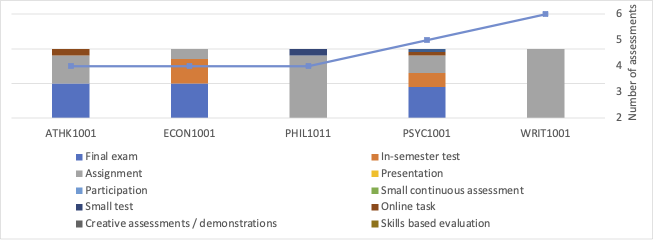
Types and relative weightings for the assessments in ATHK1001 and for the units most commonly taken units alongside it.
Helping students understand their assessment workload
The tasks above could also be completed by students to help them plan their unit choices and their work during semester. They have access to unit outlines (either published or from previous years) and would simply replace the KYS step with their own unit choices. Such a task could be combined with a
time management activity.
Tell me more
- How Much Assessment is Enough?
- Further reading:
- Enrol in the
MPLF module 05 Assessment and feedback for learning
(next running in July 2023). - Book a
consultation
with the Educational Innovation team for advice on how to re-design your assessment.