Comments
shared by students
in the semester 1 USS, and
presented
as a qualitative
topic–model
analysis
at this year’s Symposium
by
Jess Frawley and Sam
Clarke,
highlighted
something that we know well:
students
value
clear communication and
clear
expectations.
By way of
the USS
survey,
students
have
provided
indisputable
feedback. Clearly explained
content,
clear weekly structure and clearly
structured
online teaching were
amongst the best aspects of their
experience.
Equally, students
frequently
shared that hard to follow structure,
lack of clarity
(especially
in
assignments),
and
too much content
were aspects that needed
the
most
improvement.
It is important
to be
reminded
of
these
issues
and
to consider
the
practical changes that you can make to improve communication and set clear expectations
when you publish
learning materials
in
your Canvas site.
Publishers know that a clear message is
essential.
In
research
publications
we
aim for
a
concise
and
persuasive
abstract as we
know that
the
abstract
is the tool to
communicate
your research succinctly while
highlighting its most important facets.
News publishers,
such as the BBC,
know
that a clear message is essential.
The BBC
style guide
is an iconic document
provided to
ensure
consistency
and
because,
as we know too
well,
typos and blunders
make great
headlines.
To
help Canvas
publishers of learning materials
we have developed
a short style guide
to help you
keep your resources and Canvas site clear and consistent.
This post was contributed by Catherine Walsh,
Tina Barclay
and Andrew Carfax-Foster, Education Design
Team
in the Faculty of Medicine and Health.
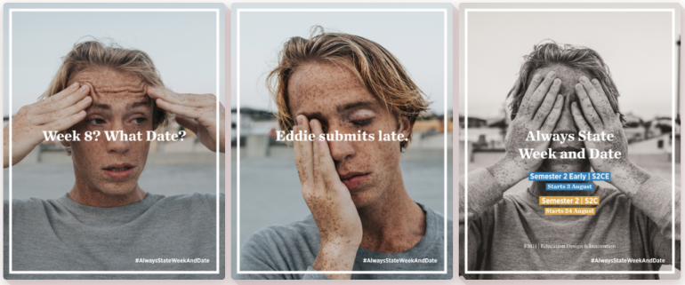
1. Always state week and date
Semester
2
2020 is quite unique in our university’s history, not least of which, the university is running two
concurrent
semester 2 sessions. On the face of
it, two semesters
is
a simple solution to an organisational issue. However, from the student’s point of view this may provide an extra layer of complexity and confusion.
We have
two week
5s, two final exam
periods,
and extra intensive sessions.
There is an easy way to bring
clarity;
simply always state week and date.
Always.
When presenting lectures, when typing due dates in documents and
when
producing
lecture slides
specify both the week and the date.
Time management and planning are essential skills for
student
success.
You can help reduce
trip hazards
for students
by simply
always stating week and date
in every document you publish.
2. Use the calendar
to improve
planning and prioritising
With more online activities now that students are not often on campus it is helpful to provide clear alerts to online activities. We want students to be able to easily understand the requirements of the
course
so we need
to communicate clear expectations.
Canvas is
clever. It generates calendar items and the to do list for
you and your
students whenever
you
set a date
using the
calendar
form in the text box. Every place a date is used in your Canvas site, as an Assignment, Discussion Board, Quiz or Zoom tutorial, a calendar item is generated.
You can
also
add additional calendar
reminders, to help
students plan their learning and organise themselves.
When you use the calendar text box to add a date the dates
also
appear in the
To Do List,
Syllabus page
and, for assessments, the
Marks
page.
3.
Use Canvas modules for site integrity and cohesion.
Canvas is a publication and a well-designed publication needs a clear structure, an index or table of contents.
The organising principle for your course structure is
Modules, in which you make pages and show the course progression for students.
Modules are used to organize course content by weeks, units, or a different organizational structure.
“Modules essentially create a one-directional linear flow of what students should do in a course.“
Think of
modules
as
providing
a cohesive architecture
that
benefits student-centred
learning.
Cohesion also suggests that students feel they belong together as a group with mutual dependence in the community of their unit of study, which is housed in your Canvas site. We want students
to navigate easily in a space they feel is their community.
Practical tip:
Make sure modules are visible to students
in
your course menu, add new pages, assignments, discussion and other learning content
to the modules as you
publish
them.
Plan this page as a linear table of contents
and keep it up to date.
4. Use
headings to chunk
Even if you didn’t read this
article, you probably still read the
heading above this sentence.
The heading is an example of a
UX
(user-experience web design)
chunking strategy.
In general usage, a ‘chunk’ means a piece or part of something larger. In the field of cognitive psychology, a chunk is an organizational unit in memory.
According to cognitive load theory people have a limited capacity to process new content at a given time. We process our thinking about new information in our working memory before we reinforce it and shift it to long term memory. Chunking of new information is a
strategy you can use in your classroom
to help students
remember and learn.
In the field of user-experience design, ‘chunking’ usually refers to breaking up content into small, distinct units of information.
In your Canvas site you can use
UX
strategies used by web designers to
chunk content and
get a reader’s attention:
- Short lines of text
- Headings
and
subheadings - Summary
paragraphs
for longer sections of text - Highlight key words and groups of words (bold,
italic) - Numbered and
bullet point lists
We want students to spend their capacity for learning on the content of the unit of study and applying what they have learnt. We don’t want students to waste their capacity for learning on trying to navigate your unit site, so we aim for
page content that
is
easy to skim
read, comprehend and
remember.
teaching
5.
Say it once,
say it well,
and link
A core principle of good design is:
Say it once, say it well, and link. This principle reduces duplication and lowers the risk of publishing
similar information on different pages, so students don’t know which is the source of truth.
Students have given us feedback that a lack of clarity,
especially in assignments,
is an important area that needs to improve.
We have found that it
is common for a
single
assignment
to be described
in
multiple
places
in a Canvas site:
an announcement,
the assignment
dropbox
page, as well as
a
Canvas
page that summarises
all the
unit of study
assessments for the unit.
This provide at least
three
sources
of information about the assignment.
A better strategy
is
to
use only
the Assignments page.
Use the
instruction
field for
that assignment to provide all information about the assignment. If
you
need to update
information about the assignment,
make the change there.
When making announcements about the assignment
provide a link to the assignment
in the announcement,
and maintain one source of truth.
In
any page in your site you
can insert links
to
Assignments, Discussions, Pages, Quizzes, or any page in your navigational tool bar.
6. You need a
proofreader
You
wouldn’t publish an academic paper without deciding on your structure, checking your references
and asking someone to proofread. The same applies to your Canvas site. Everyone makes typos. Even Pulitzer prize winners have editors and proofreaders. It’s a good idea to ask someone to check your Canvas site.
It is important to also check your hyperlinks. These are the links to content
either within your site or
outside the unit site.
Canvas has some neat features to help you here.
In Settings on your navigational tool bar you’ll find the button to Validate Links in Content which will find your broken links so you can either delete or update them.
And be careful to avoid
underlining
text which is not a hyperlink.
The
BBC guide style guide
explains that “Our use, or perceived misuse, of English produces a greater response from our audiences than anything else. It is in nobody’s interest to confuse, annoy, dismay, alienate or exasperate them.”
The various pages and features work together to make a consistent whole course for your students. Each page or feature in Canvas can contribute to the students’ experience and the learning outcomes for the whole course.