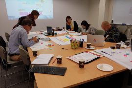
Over 70 physical classroom doors are being flung open across the University during the Week 4 // Open Door event. As more and more units pick up Canvas, the University’s new learning management system, a number of academics and designers from around the University have opened up the doors to their virtual Canvas classrooms. Find out more about these open virtual doors, the exciting blended learning experiences that Canvas enables, and how you can tour around colleagues’ Canvas unit sites.
The following sites have been opened up for anyone with a unikey to browse. To protect student privacy, these sites are clones of the actual live sites, without any student data. When entering these sites, you’ll be viewing them as a restricted observer and will be able to see most material and site structure, although quizzes and discussions will be unavailable (and may show up as ‘unauthorised’).
GEOS1003
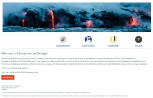
As you scroll past glowing lava flows steaming into a raging sea, the coordinators greet you with a friendly message and invite you to get started on your geological journey. This site rocks (sorry) a clean design, taking advantage of the ‘website’ feel that Canvas provides for. One of the GEOS1003 academics quipped:
There are so many benefits to using Canvas, it’s hard to pick one! It’s easy to pick up, quick to use and update, and visually appealing. It allows you to create a great looking site that has increased functionality, operating well beyond a simple set of virtual filing cabinets for course content.
Things to look out for:
- A comprehensive FAQ to answer top student questions and save academics’ time.
- Intuitive module structure that separates learning materials and activities by topic, and guides students through the curriculum.
- One-stop-shop semester outline and program with direct links to relevant content.
- Friendly pages that bookend module content and guide students to key resources and activities.
HSBH1010
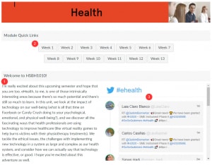
As you’d expect from a unit about e-health, social media features prominently on the homepage in the form of a customised Twitter feed that brings in relevant news live from across the planet. Surrounding a friendly greeting from the coordinator, you’ll find buttons that provide easy access to weekly content. The coordinator relished how Canvas helped her to think differently about site design:
I love that setting up my unit in Canvas allowed me to set aside time to think about the ‘story’ of my unit. Since it looks more like a website, we had to think about what text would accompany which files, and how it all fits together. I enjoyed being able to add commentary to the documents, using different mediums to support accessibility, and the nice, clean layout.
Things to look out for:
- Modules and pages arranged by topic and week to seamlessly link to pre-work and in-class material and activities.
- A professional ‘meet the experts’ page with short biographies, Twitter handles, and photos of teachers.
- ‘House’-based gamification elements (based on Game of Thrones) that encourage student engagement.
CIVL2010
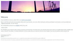
A minimalist homepage welcomes you and points straight to staff contact details and the site’s modules. Behind the scenes, the coordinators innovatively use unpublished pages (hidden to students) to distribute tutorial plans and collaborate with their teaching team, allowing anyone to share approaches and tips – they have kindly opened up some of these pages. One of the coordinators highlighted how Canvas can dramatically improve the student experience:
I think students will enjoy how easy it is to find content. Our site has six content modules where they can find all our content – slides, assessments, tutorial descriptions – for each topic that we’ll be covering this semester.
Things to look out for:
- Assignment descriptions are seamlessly presented above assignment submission dropboxes, providing an integrated experience for students.
- Modules are split by topics, with a consistent lecture, tutorial, minute paper structure to support active learning.
- Pages are clean and designed with accessibility in mind.
- Creative contextualisation of the entire unit as working in a civil engineering firm. For example, tutorials are briefing or training meetings, some assignments are pegged as ‘CPD’ (continuing professional development), etc.
- Custom slidedeck as embedded HTML pages.
MKTG6104
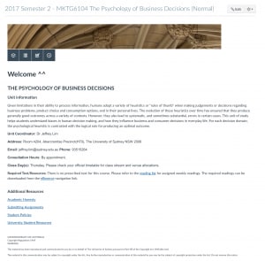
Recent announcements sit atop a minimalist but inviting homepage with iconic links to key assessment information and course content, followed by key contact details. Exploring further, the site is neatly partitioned into topics with well-signposted materials and activities for every week.
Things to look out for:
- One-stop-shop pages for weekly materials and activities, to keep navigation and access as straightforward as possible. Complete with inspirational quote!
- Calendar grid of course content that is accessible and responsive (adjusts to device width).
- Neat home button at the bottom of each page.
EDPR6012
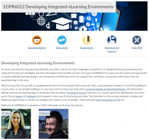
In this unit designed for in-service university educators, a series of simple menu bars take visitors straight to important areas and face-to-face session content, past a welcome message from the coordinators and a story about Canvas. Key content is within a click or two from the homepage.
Things to look out for:
- Session-based pages house embedded rich media like Google Slides and Docs and Sheets content, YouTube videos, Padlet boards, etc.
- A page that has been turned into a student-editable wiki for unit participants to curate their experiences.
- Embedded quick feedback survey at the bottom of each content page, powered by JotForm.
PAIN5002
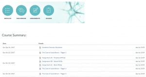
Leveraging the Canvas syllabus, visitors are presented with an assessment-focussed view of the semester accompanied by quick links to course content.
Things to look out for:
- Really useful page for students on getting started with Canvas, complete with overview video and links to update profiles and notification preferences.
- Modules that hoouse core readings and video resources.
OCCP2084
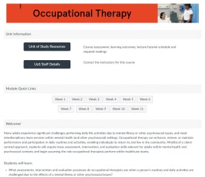
A straightforward Canvas site with quick link buttons on the homepage that takes students straight to relevant material.
Things to look out for:
- A simple weekly module structure that contain straightforward pages that link to internal and external content.
- Topic-based discussion areas to help target questions and answers.
Tell me more!
- Sign up for a Welcome to Canvas session to start your Canvas journey
- Check out the growing collection of short, practical articles on Teaching@Sydney about designing and thinking in Canvas
- Chat on Yammer with others who are building in Canvas


