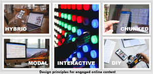
The move to online learning and the subsequent impacts of our opportunities to teach at scale in large rooms has seen many academics rethinking the nature of the lecture. Lectures have moved from the physical to the virtual, with a camera on a tripod replacing the lectern and gallery view replacing the faces of people sitting in tiered theatres. Online lectures require a different skillset to design and deliver, and different methods and metrics to evaluate their effectiveness. They also present significant opportunity for units to leverage the affordances of the medium and to share the perspectives from and stories from a diverse community of voices.

Transitioning from a recording of the lecture we were previously presenting in a classroom to the one that makes the most of the technology and how it is consumed is not a strictly linear process. Some modes of teaching that work in a lecture theatre might seem distant or impersonal on video. The expectations, behaviours and learning capabilities of students varies markedly between different styles of media, the quality of the platform and the recording and the quality of the delivery or teaching itself. To help the academics at the Business School deploy and enhance their approaches to the ‘pre-recorded lecture’, we have developed a set of design principles built from our Connected Learning at Scale approach, that have helped facilitate the rapid shift to entirely online content delivery in 2020 and to effectively manage the significant student numbers increases from S2 2020 and into 2021.
DIY
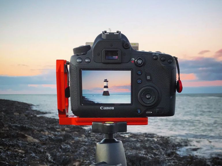
Supporting staff to make effective video for themselves is critical, especially to scale the transition to recorded lectures. From technology support to skills in narrative storytelling, being able to do-it-yourself is a key skill that enables colleagues to deliver content. DIY makes us all content creators and content curators, bringing together media we make and that is made by others, bringing this to life in a way that may have been done in more static ways in PowerPoint slides. At the Business School, we have developed a range of resources for academic staff and students, a community of practice and most importantly exemplars so that colleagues are willing to take a risk, clip on a microphone, press the big red record button on their phone and go for it. Editor’s note: DIY kits and a DIY recording studio are centrally available for anyone at the University to use for free.
Chunked

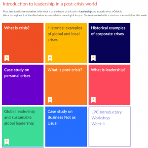
Two-hour long lectures to camera are hard to do and can be difficult to watch in one go. Student viewing behaviour on the other hand often has students finding the bits of learning they struggled with and watching it over and over. Chunking content is one way to overcome this. Chunking is breaking the lecture into smaller sections, for example in the screenshot to the right, which comes from the Canvas site of unit of the Business School. Each block represents a smaller sequence of video, activities and sometimes opportunities for students to contribute their own user generated content. We have experimented with breaking content up, reordering it and enabling students to find their own pathway through the content. We have given students agency of their learning journey through the lecture, as well as providing some guidance about the key theoretical building blocks of each week (the stars in the screenshot).
Interactive
Watching media can be a passive experience, especially if delivered through didactic engagement and broadcast pedagogies. Interactivity encourages students to make connections within and between themselves and the knowledge being shared. We have been working on the idea of being synchronously asynchronous where activities from polling, to discussions, to social media-inspired emoji interfaces (like buttons), to the use of more complex problem-solving approaches are embedded in the video and its LMS surrounds to encourage interaction at the point of watching, enabling students to see the contributions of their colleagues, sometimes in real time.
Modal
Modal describes the different types of media that can be aggregated to structure a block of content. From both the changes of perspective that come from different voices and different types of video, through to the use of animation, narrated slides, podcasts and panel discussions, media offers many different modes of engagement that a face-to-face lecture can’t. The layering of technology such as HTML5 and the integration of learning tools like those in Echo expand the opportunities for content to be multi-modal.
Hybrid
Hybrid considers the affordances of the devices and the spaces where the media can be engaged with. From consideration of the user experience (looking at navigation, responsive design on mobile and accessibility) right through to how media can enable HyFlex delivery with students in class and online watching the same materials at the same times in different spaces, media can be flexibly designed for multiple hybrid spaces, as opposed to a lecture which is designed for one. There is an excellent and helpful post by Adam Bridgeman on this very topic.
Find out more
These design principles shouldn’t be seen as a set of activities or as a checklist. They are like faders on a mixer. You can play around with them, add or subtract and find the balance that suits your area of teaching, your students and you. And none of them undermine the critical importance of good pedagogical design, not too much or too little in each week, opportunities for students to stop and reflect and the importance of application. But they will help you leverage the benefits of this shift.
- If you want to know more about what the Business School are doing or would like to see some of the resources or the units where this has been deployed, email the Business Co-Design team.
- If you want to know more about the Connected Learning at Scale initiative, click here.
- If you want to see a short example of how these design principles come together, you can watch an interactive video for the Business School Leading in a Post-Crisis World program here.


1 Comment