Good (or bad) site navigation and organisation can go a long way towards making (or breaking) your unit of study Canvas site. Creating a well designed learning environment is one way teachers can help student learning. Designing learning environments (online or physical) that make engagement with content and activities intuitive reduces extraneous cognitive load and shifts unnecessary focus from deciphering how to find what is needed (“do I click here or here for my readings?” or “wow that’s too much, I don’t even know where to start”), producing a more enjoyable and meaningful learning experience for your students. Common causes of increased cognitive overload due to the (poor) design of learning environments include too much new information at once, unnecessary actions, site errors, and unclear structure.
(Re-)designing the navigation and organisation of your Canvas learning environment can reduce the cognitive overload on your students and allow them to engage with what really matters – the unit material
Based on feedback from 5000+ students across the University about their unit of study Canvas sites in semester 1 2018, we’ve identified some top “design for learning” tips to help improve the navigation and organisation of your new or existing Canvas sites. We have also included some examples of best practice taken from Canvas sites that were identified as outstanding by students.
This article was contributed by Rebecca Goldsworthy, Jennifer Burn, Wilfried Sharp, and Samantha Clarke.
How to “Design (your Canvas site) for Learning” using good navigation and organisation
When thinking about how to organise a Canvas web page or site, it can be useful to think of the exercise just as you would when designing any piece of visual media such as art, film, web site, or magazine layout. When designing visual media, the underlying goal of the artist or designer is to control how a viewer’s eye moves about the work – does the eye move quickly or slowly over particular areas, which direction should it travel, and in what order? By understanding how we can use visual design elements to guide a student’s eye around a Canvas page and to help navigate our sites, we can assist them to engage more readily with the learning materials.
Structure
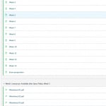
Structure refers to the layout of individual pages as well as the information hierarchy – that is, how everything relates to each other.
Plan out your structure
Think about where you will put your information. Use modules to make the structure of the course clear to everyone interacting with the site. Create folders in your Files area, even if this is hiden from students.
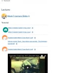
Use weekly/topic content pages
Feedback indicates that students prefer all the relevant information and materials for each week or topic to be located in one place – for example, on a weekly/topic content page. They also like to see a weekly ‘to-do list’ at the start of these pages. This allows them to know what is ahead, help to set goals and give focus, rather than just stumbling across what is expected at the end. Side note: students also appreciate it when lecture slides are made available prior to the lecture so they can prepare in advance.
Minimise “clicks”
Students try to spend as little time on Canvas as possible, and every extra click or page takes up time. When all the relevant files and notes are on the one page this saves a lot of time and makes it easier for students to interact with content and download material from just one location rather than several. An exception to this “one page for all weekly/topic content” rule applies when a page becomes extremely long and unwieldy. If this happens, don’t be afraid to create a “Part 2” page. See “Top 5 student tips for improving your Canvas site” for more detail on splitting up your pages.
Grids
How content is organised in a site or on a page influences how a learner moves through your site and encounters the material. Grids help break up materials into bite-sized chunks, control the length of text strings, and impose an organisational system that is attractive to the eye. Read more about how you can use grids to improve the structure of your Canvas pages here. But these aren’t for the faint-hearted – there’s some tricky HTML to master to get grids right.
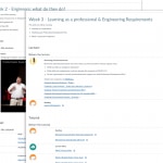
Be Consistent
Consistency is key! It’s easy for students to get confused about where to find information and identify what is most important and relevant. In the University-wide Canvas survey, students commented that they didn’t like the way different units placed important information in different and various places rather than just one key location. Students also didn’t like it when too many external platforms were used such as separate websites for content.
Top recommendations to keep things consistent (and less confusing) for your students:
- Make use of your Faculty or School’s Canvas templates to ensure the students get the same experience across similar units;
- Use text styles (e.g. Header 2, Header 3) consistently to enforce an information hierarchy (and don’t skip levels);
- Use icons to help identify information types and/or facilitate navigation – this also incorporates familiar experiences (such as navigating websites) into your Canvas sites;
- Make sure you stick to the plan and don’t split across different locations or platforms – the “single source of truth” maxim;
- If there are multiple instructors in a site make sure that everyone knows (and follows) the structure of the site;
- Don’t replicate material or information (particularly around assignments) across multiple places/pages – this also makes it really difficult for you to update information;
- Don’t open new windows for internal links (i.e. if they link to a page within the same Canvas site).
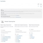
Chunking + Signposting
The concept of information chunking is well-known. Break down your information into smaller manageable pieces. Keep in mind that chunking can refer to more things than text: images and videos can be “chunked”. Use headings to separate your “chunks” and don’t forget the power of “white space”.
Activity + Variety
Embedded activities that test knowledge, present knowledge in novel ways, or provide opportunities for collaboration, not only reduce cognitive overload by providing variety, chunking information, and reducing clicks, but also actively reinforce learning by asking students to apply their knowledge as they learn it.
Where to next?
These are just a few ways you can use good navigation and organisation practices to quickly and easily improve your existing Canvas sites or lay strong foundations when building new sites or revising existing ones.
- To be inspired and see what has worked well in other units across the university, be sure to check out the Open Canvas sites – 2018 students’ choice list and the Open Canvas Sites – 2018.
- Have a look at the resources and guides in the Teaching Resources Hub on designing and structuring Canvas sites.


1 Comment