In Why Think About Accessibility? Heidi Laidler highlighted the importance of making content in Canvas accessible to users with disabilities. As Heidi explained in her article, users with auditory, cognitive, physical and visual disabilities interact with content in different ways and may struggle with, or be unable to use, content that is not designed with their needs in mind. In most cases, creating accessible content is relatively easy and improves the user experience for everyone.
How do we create accessible content in Canvas?
Accessibility is a key focus for Canvas and the platform has important features that make navigating and interacting with pages easier for users with disabilities. Many of the requirements for accessibility are built in to Canvas, but as content creators there is more we can do to ensure our content is accessible to everyone. Below are some practical tips to improve the accessibility of your pages.
Write text in Canvas
As much as possible, write text content in Canvas using its easy-to-use Rich Content Editor instead of using images of text or by linking to downloadable files. Text written in Canvas pages is readily accessible to users with vision impairment who need to enlarge the page or change page colours and fonts to make the text easier to read. Similarly, text in Canvas pages is directly accessible to the screen readers used by people with blindness to speak page content in synthetic speech.
When writing text in Canvas also consider how to maximise the readability of your content. This helps all users digest the text content, but it is particularly beneficial to users with reading disabilities:
- Consider chunking the content, by breaking the text up into smaller units of information, with headings, subheadings and paragraphs separated by whitespace
- Use the simplest language appropriate for the content and avoid unnecessary jargon
- Avoid ALL CAPS as it can be difficult to read
Use a simple layout and clean design
Pages with a simple layout and clean design will result in a better user experience for everyone. Uncluttered pages with a consistent look and feel help all users find content and navigate pages more easily. Users with cognitive and learning impairments also benefit when content is presented in a clear and consistent manner. Where possible, try to use linear layouts for Canvas pages, which will make them easier to navigate with screen readers.
The University Canvas templates and sample pages available in Canvas Commons have been designed with accessibility and usability in mind, so try to use these where possible.
Use descriptive headings
Headings are used to create an outline and hierarchy of the content that helps all users scan the pages. Headings are essential for screen reader users, who can use headings to generate an outline of the page content. Screen reader users can also jump between headings on a page using a single keystroke.
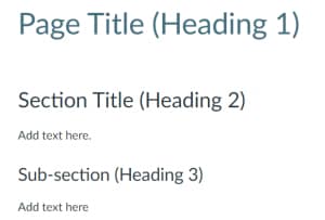
Canvas provides several section heading levels and automatically generates the page title as an H1 (level 1 heading).
Good headings provide a clear and short description of each section. Headings should also be correctly nested. Lower level headings should be contained in higher level headings; so for instance, Heading 3 would be used for a subsection of content contained within a Heading 2. It’s also important not to skip heading levels, such as by placing a Heading 3 directly below a Heading 1.
Provide alternative text for images
Alternative text or ‘alt text’ provides a text equivalent for images and is essential for users who are blind and use screen readers. The alt text will be voiced when the page is read with a screen reader.
In Canvas you add images via the insert/edit button on the rich text editor, which includes a field for adding an alt text description.
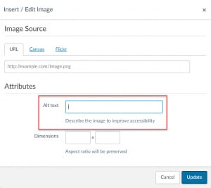
Good alt text:
- Succinctly describes the content and function of an image
- Avoids phrases like ‘image of’, ‘picture of’ in the description. Screen readers automatically inform users if the content is an image
- Does not merely restate information already available in the text content of the page
Note that if you don’t add alt text when inserting images, Canvas will use the filename, which is unhelpful for screen reader users.
Provide meaningful link text
When writing link text it’s important to describe the content of the link destination instead of providing lengthy URLs. Also avoid using ambiguous link text like ‘click here’ and ‘read more’. Screen reader users are able to generate lists of links on pages and jump between links, which means the surrounding content of the page is not always voiced. Providing a meaningful link description ensures that screen reader users can determine the link destination even when links are voiced out of context. For instance:
For more information on how to make your content accessible click here.
Could be changed to:
The accessibility pages on the staff intranet have more information about how to make your web and digital content accessible.
Use good colour contrast for text
Text with good contrast is easier for everyone to read, but is essential for people with low vision and colour blindness. Try to stick with the default colours used for text and links in Canvas, which meet accessibility guidelines. If you wish to use colour, choose colour combinations that provide good contrast.
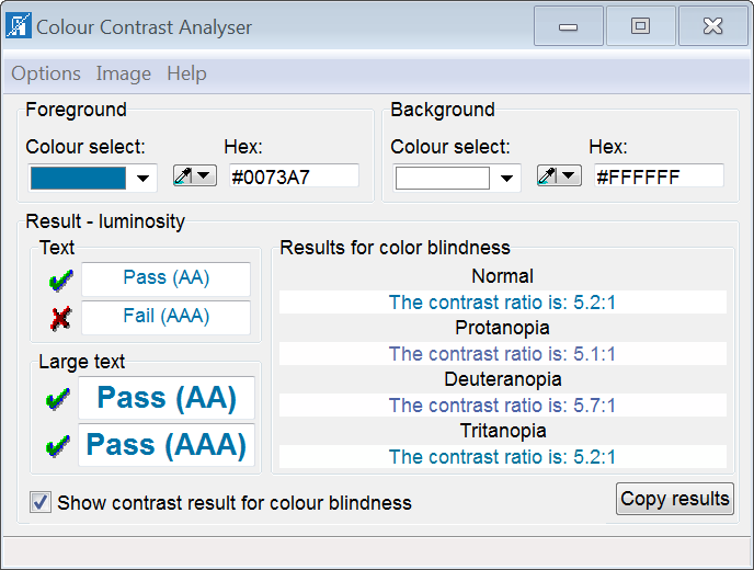
One way to check whether there is good contrast between text and background colour is to the Colour Contrast Analyser , which is free to download and works on Windows and Mac. The tool has an eyedropper function that allows you to select the text and background colour and view the contrast results. The tool also has a feature which simulates the contrast output for different types of colour blindness.
Create accessible data tables
Data tables are used to display tabular data in a manner that makes the relationships between the information easy to understand. Accessible data tables provide extra HTML markup so that screen reader users can also perceive these visual relationships. Providing a caption for data tables, and specifying which cells are the column, and/or row headers will make our data tables easier to navigate with screen readers.
Tables can be added to Canvas pages via the table tool in the Rich Content Editor. When creating tables that contain data, we can add a table caption and specify which cells are the headers for columns or rows in the table. When screen reader users navigate a table with this extra information, the table header cells can be voiced as the user moves between the cells.
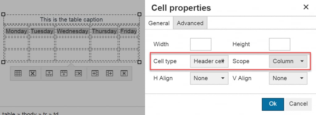
When creating data tables in Canvas, try to keep them simple, with only one level of column or row heading. Note that table captions and headers should only be used for data tables. If you use tables for layout, you should not include this extra information for screen reader users.
Add closed captions for videos
Video captions are essential for people with hearing impairments, but are beneficial for all users. After a recording or uploading a video in Canvas via the Rich Content Editor, an existing caption file can be added or a new one created using the subtitle creation tool. Use the instructions for adding captions to new or uploaded video in Canvas for more details.
When embedding externally hosted video in Canvas pages, it’s also important to ensure they are captioned. Most video platforms provide the capability to add captions. Captions can be added to our created YouTube videos via the Video Manager.
See the article on Accessible video on the Staff Intranet for more information.
Tell me more!
If you are creating documents for students to download from Canvas, there are resources on the Staff Intranet to make your documents accessible:

