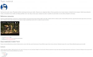
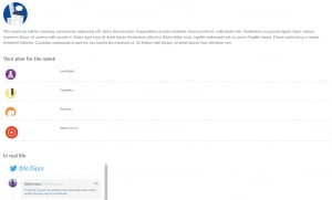
As we move our units to Canvas over the next few semesters, we have a chance to reimagine the way that our unit of study sites look and behave. We highlighted in the first ‘Thinking in Canvas’ article how Canvas has a fundamentally different approach to presenting material – an entity called ‘pages’. Canvas pages can look and feel like normal webpages, which means that your unit site can break out of an item-by-item structure that our current learning management system (LMS) imposes. In this article we compare how unit sites might look and behave differently in Canvas, and show a few visually appealing templates that you could use when designing your own Canvas sites.
Side-by-side
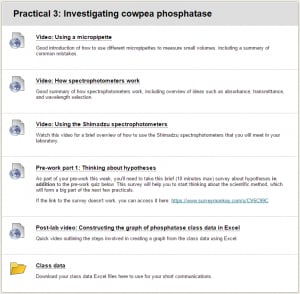
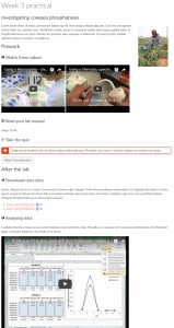
To give you an idea of how a Canvas page can make your unit’s material more fluid, dynamic, inviting, and meaningful, here is a side-by-side comparison of resources surrounding a single class in a particular week of the semester, as currently exists in Blackboard and how it might look in Canvas. (Click the thumbnails to see the entire image).
Notably, Canvas pages allow you to structure unit material in a much more website-like way. Apart from the fluid structure of the page itself, you can include elements such as:
- Embedded videos (properly embedded, as opposed to links or ugly thumbnails)
- Floating images
- Alert boxes
- Buttons
- Inline links (when documents are linked in Canvas pages, they can even be previewed right there on the page without opening up a new tab or downloading the file)
- Icons to help wayfinding
Structuring your Canvas pages
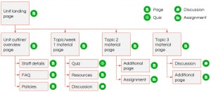
The most important design paradigm to remember is that in Canvas, your unit site can look and feel like a normal website. So when you are ‘thinking in Canvas’, consider how your unit site might look and behave if it were any other website on the internet. When you visit the Sydney intranet, or The Conversation, or the BBC, or Microsoft, what do you see on the landing page, and how do you click to where you need to be? Take that same mindset and apply it to your unit site.
The image to the right presents a possible structure where students first land on the landing page (which is a Canvas ‘page’), which has links to topic material and unit overview pages (each also a Canvas ‘page’). The ‘page’ for a particular topic may then have some descriptive text, embedded video, and links to other unit material such as quizzes, discussions, and other resources.
Page templates for universal design in Canvas
We’ve been working with a few people around the University, in particular Rebecca Goldsworthy from the Faculty of Engineering and IT, to develop some templates for Canvas pages that you could drop into your Canvas unit site. Some of the major concerns that students have with the existing LMS are around inconsistent navigation and confusing site structures. And we haven’t even touched on issues around accessibility. To help address these when we all come to reimagine our unit sites within Canvas, we hope that these templates that we are putting together will help to:
- Make navigation and structure more consistent and less confusing for students across units
- Address universal design principles including meeting the targets of the Disability Action Implementation Plan
- Make unit sites more visually appealing
- Provide ideas for what to include in pages and how to structure unit sites
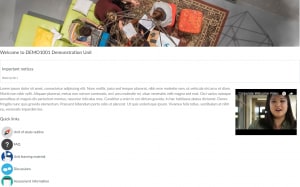
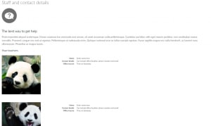
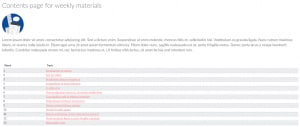
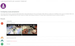
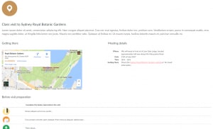
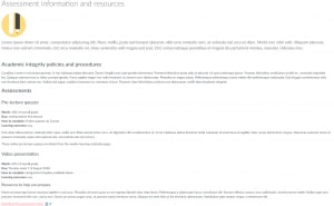
Here are a few screenshots of these templates (click the thumbnails to see the entire image). We’ll be putting up more information about these in the near future – watch this space!
Tell me more!
There are ‘Welcome to Canvas’ sessions organised from now until August with more to be added. If you’ve not already been to one, book to attend now.
- Canvas announced as the new LMS
- Why think about accessibility in the new LMS?
- Creating accessible content in Canvas
- Thinking in Canvas – an introduction
- Using modules to make your unit a real page-turner
- Using pages for collaborative learning
- Welcome to Canvas orientation sessions
- If you have any ideas for templates, or would like us to help you reimagine your Blackboard site design in Canvas, please get in touch with [email protected] or [email protected]
- Keep an eye out for more ‘Thinking in Canvas’ articles soon to appear here on Teaching@Sydney.


