Earlier this month the FASS Teaching and Technology Innovation Team spent a few hours with a dozen students testing a suite of new Canvas sites to be rolled out in Semester 1, 2018. We wanted to see how students interacted with the sites, which sections were appealing, and what we could improve prior to next year. Students jotted down notes while navigating the sites, completed surveys after testing, and participated in a focus group discussion. Many of their reflections are useful to consider in our transition from Blackboard to Canvas.
Here are the major points students brought up for each site:
When using videos on your Canvas site, ensure you clearly and explicitly explain their relevance and importance for student learning and the course.
One of the best facets of Canvas is the ease with which you can embed videos from a range of sources right into the heart of your content. While it can be very easy for passionate academics with love and experience of the subject to judge the relevance of videos for the subject, this needs to be stated for students clearly. Without this, the hard work you have put into collating these materials is more likely to be scrolled past and ignored by students who are only seeking the most vital information. Be sure to explain what you want them to learn, how it ties into the course, and whether this video is required viewing or extra material. Remember, there is nothing wrong with written information.

Clearly signposted organisation of your course – whether by themes, weekly lectures, modules, or topics – makes learning and navigation easy for students.
Organising each section of the course into specific pages, and groups of pages is another great tool in Canvas. For example, one way of doing this is to use a Module, giving each page the ‘Previous’ and ‘Next’ buttons at the bottom, which helps students navigate their way through your content without having to return to Dashboard each time they need to retrace their steps.
When students can see where they are up to in a particular section of the course with clear links, an organising pattern, and a button to the next logical step, many students stated this would help them track their own learning, understand what is explicitly required of them, and allow them to revisit sections for revision study as needed.

Check the mobile version of your site using the Canvas app to ensure your course works on mobile devices.
One of the consistent concerns of these students was that the course site had to be useable and friendly on mobile devices. Ensure that you test-run your own site on your mobile or tablet device using the Canvas app prior to activating your site to see what needs to be altered before students use it. Some aspects of your site may not be accessible on a mobile device, so remember to check the Canvas Community Guides for recent developments.
Avoid using tables for layout when developing your Canvas site.
Using tables to lay out content makes it non-accessible. Screen readers are expecting data so do not handle the content appropriately. Instead, try and take advantage of Canvas’ Rich Content Editor and pre-formatted headers. The latter also gives your courses an appealing and consistent look for students regardless of their screen size.
Avoid pasting from Microsoft Word
Copying and pasting information from Microsoft Word can also create layout issues. It is preferable to paste into a rich text editor such as Notepad or TextEdit before copying into the Canvas editor. Then use the Rich Content Editor to set headings. In addition, copying large amounts of information creates web pages that are lengthy, difficult to navigate, and less likely to foster engagement. Instead, split up the information into manageable chunks in order to make the learning process clear for students.
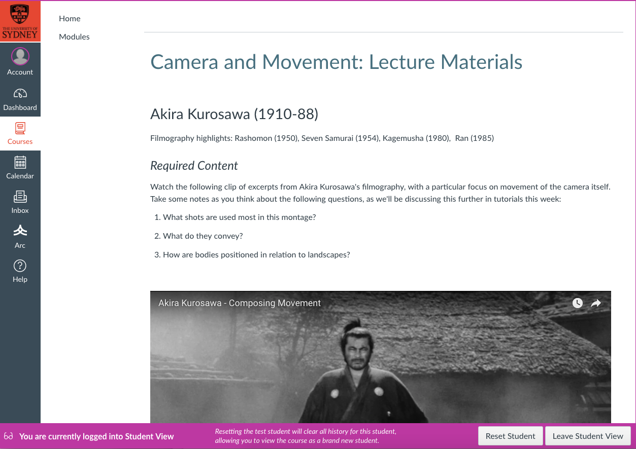
Use Student View to ensure your site is ready to go!
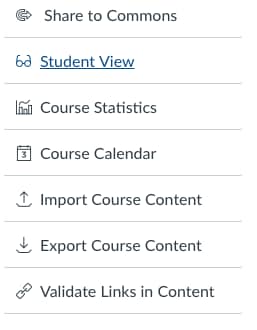
The easiest way to see if your site is ready is putting yourself in their shoes via Student View. To access this tool, go to ‘Settings’, and click the ‘Student View’ button on the right. Student View allows you to catch any last-minute issues with your site that would prevent it from looking and running at its ‘friendliest’ throughout the semester. Running the ‘link validator’ – also found in Settings – is another way to check your site is behaving as it should, and that students can access your content.


For more information: The FASS Teaching and Technology Innovation Team have also made a variety of their infamous Quicktips for Canvas – including how to create drop boxes, set up your site, and managing students’ grades – to give you a head start in transitioning to Canvas in 2018-19.
For further guidance through Canvas, contact Education Innovation or your Faculty Educational Designers, and check the Canvas Community Guides for help on-the-go.
Written by Alex Page and Jennifer Dowling
FASS Teaching and Technology Innovation Team


