Over the past fortnight, the FASS Teaching and Technology Innovation Team ran two feedback workshops with a dozen students testing new Canvas sites for publication in 2018. As with the previous round of focus discussions, we wanted to see how students interacted with our sites, what appealed to them, and more importantly, what we could improve upon and polish prior to the new year. Students took notes while navigating the sites, completed surveys after testing, and participated in a detailed focus group discussion about their experiences.
Here are a few more tips for student-friendly sites in Canvas in the hope readers may save some time and energy learning from successes and areas in need of improvement. All quotes are directly from students.
Use a clear and convincing Front Page to get students immediately interested in taking your Unit of Study
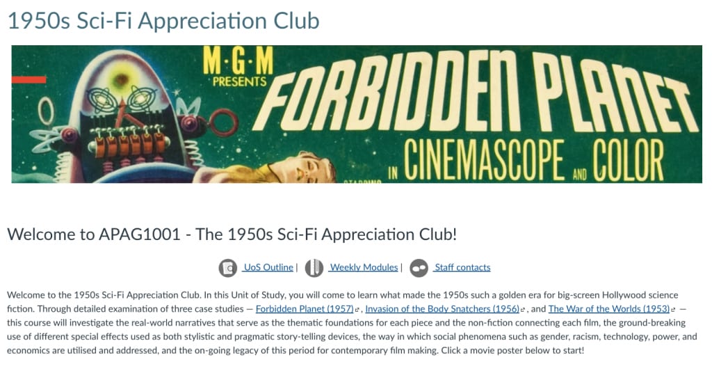
Canvas allows you to create a look and feel for your class from the very first page students see. Your Home or Front Page is a great way to entice students to take your unit. This can be done through a ‘Contents Page’-style layout, or the use of icons for each module, topic, or weekly lecture to clearly show how each piece of the course is tied together. This means students could remind themselves of the overarching ‘narrative’ of the course throughout the semester, and many stated it would help to keep them on track with their studies by clearly linking progression through each part of the class, with explicit learning outcomes practiced in the assessments. In our sessions, students were enthused by sites that created clear Front Pages and specifically told students “what [they would] be learning”, provided an introductory paragraph about what the unit was about, how each component would help them develop their skills, and some brief discussion of the interesting topics included in the unit.

Students perceive videos in a hierarchy of importance, so choose and frame wisely
“If YouTube videos are chosen well, they can be good… but if they’re Faculty [branded] videos, I know that this is what you want me to learn, it’s helpful for having structure.”
Videos within Canvas were considered to be engaging by students if they were concise and communicating complex issues in clear ways. However, the use of videos is understood by the students in a hierarchy of importance, with Faculty-branded videos perceived as the most important in containing the most relevant content. Third-party sources such as YouTube and Vimeo followed, with all participants reporting a preference for interview- or lecture-style videos produced by the Faculty. However, if external sources were edited to fit within the course in the shape of “a short reading on the side, and a snippet of the whole video” for example, students were appreciative of these curation efforts and more likely to engage with the material.
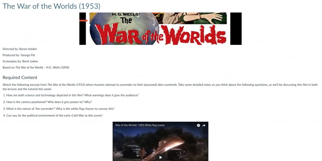
It is important to remember that YouTube videos of various lengths may give little explanation of the connections between your topic and their content for your students. Following this, students were not likely to watch a video over 10 minutes in length, particularly from external sources unless explicitly instructed to do so. Videos then “need to be put into greater context” via explicit framing of why students need to watch the video and what they were to look for. Framing your material clearly in Canvas ultimately assists students to analyse the content.

Figure 2. An example of ‘framing’ a video from an external source, in this case from YouTube. Note how the content is connected directly back to the course work, and aligned with future exercises to be discussed in the weekly tutorial in the style of flipped-learning. Image: ‘The War of the Worlds’ (1953), http://www.imdb.com/title/tt0046534/ Video: ‘The War of the Worlds: White Flag Scene’, https://www.youtube.com/watch?v=WM3PX_GiYHo
Be consistent in your use of icons, layout, and signposting for students’ ease of use
A great tool within Canvas is the ability to use icons to signify where students should find information, and what they should do with it. Students appreciated the consistency of icon use aesthetically and pedagogically across all of the sites, in order to clearly signpost course content. For example, the icons below can convey Instructions, Lecture Recording, Required Readings, Extra Links and Resources, and Assessment quickly to students across your site. In changing from one site to another, students requested consistency in icon and layout usage in order for their time on Canvas to be “predictable” and know “this is what is important” regardless of which course they are taking. Jessica Frawley, in a previous edition of Teaching@Sydney, labels this the ‘Don’t Make Me Think’ principle of website design, where you want students focusing on the ideas and content of the site, rather than their energy being spent on getting a handle on the technology itself.


Figure 3. Various icons within Canvas can be used to quickly convey what you would like students to do first, and what they are supposed to do with the various components of your site. Source: Rebecca Goldsworthy.
For more information
The FASS Teaching and Technology Innovation Team have made a variety of their notorious Quicktips for Canvas — including how to show and hide marks, set up your site, and ensuring accessibility — to give you a head start in transitioning to Canvas in 2018–19. For further guidance through Canvas, contact Education Innovation or your Faculty Educational Designers, and check the Canvas Community Guides for help on-the-go.
By Alex Page and Jennifer Dowling
FASS Teaching and Technology Innovation Team


