As we gear up for week 1, tens of thousands of students across the University will be logging into their Blackboard sites for the first time this semester. Here’s six tips that we’ve picked up from colleagues around the University for making this experience profitable and, dare we say, pleasant?
Put up an FAQ
We all get flooded with administrative emails near the beginning of semester. By the time you’ve received the 60th question on attendance or assessment requirements, it’s… probably Tuesday of week 1. A set of frequently asked questions (FAQs) right on the landing page of your Blackboard site will help to address many of these questions – and if the emails still come through, a quick “Good question, that’s in the FAQ” response will not only help your students discover information for themselves, but also get them looking at their Blackboard site.

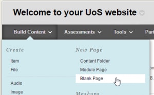
- For a few examples of FAQs from colleagues’ sites, check out this document. (This is actually an editable document, so feel free to add your own examples!). The easiest way to create an FAQ on Blackboard is by adding a ‘blank page’ instead of an ‘item’. This way you can easily edit the content right within Blackboard, instead of having to edit Word docs or re-create PDFs.
Use a different landing page for the first few weeks

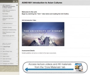
Because your students typically enrol in four different units of study each semester, there’s a high chance that they have four different LMS structures to get used to, and four different coordinators to get to know. For the first few weeks, you could set a different page that students will land in when they click on your unit from their Blackboard homepage. This page could have an introductory video (which is in itself a great way to welcome your students to the unit) and big instructions to help them get used to navigating their LMS site. Here’s an example from Matthew Stavros in the Faculty of Arts and Social Sciences, which includes a neat trailer which he put together in 10 minutes in iMovie.
- To change your landing page, check out this Teaching@Sydney EdTool Tips article.
Welcome your students to Blackboard by name
You can use a special code to display a student’s full name in any text that is edited through a content editor text box in Blackboard – this includes in the description content and in announcements. This means that when students log in, they can see a message like, “Welcome Jim Cheng!”. Caution: when you insert the special code (@[email protected]_name@X@), it must be inserted as unformatted text otherwise it won’t work. The most error-proof way to insert the code is to type it.
- Check out this Teaching@Sydney EdTools Tips article for more information.
- For further personalisation, you may want to check out this article about a system developed right here at Sydney.
Clean up the Grade Centre and students’ My Grades
Over the semesters as we clone our Blackboard sites between offerings, old assessments and other columns can start cluttering up the Grade Centre. But did you know that even though you may not see an item in the Grade Centre, students might still see the item in their My Grades view? This can get very confusing very quickly. Blackboard’s automatic ‘Total’ column also often shows nonsensical values like 153 out of 20. It’s straightforward to clean up the Grade Centre to help your students not get lost in My Grades (and think that they’ve passed the unit 7 times already).
- Check out Kevin Samnick’s very practical illustrated article on cleaning up the Blackboard Grade Centre.
Tidy up the side bar (‘course menu’)


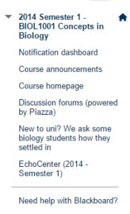
The side bar (or ‘course menu’ as it is officially called) is your students’ main tool for navigating their Blackboard site. It really helps students navigate if you can keep this uncluttered, unambiguous, and simple. For example, make use of subheadings – group the student help items together, the assessments together, and the learning materials or course content together. It also helps if there are no duplicate routes to access the same information – for example, try not to link the unit of study outline from three different places. Check out the screenshots on the right for two possible approaches to course menu design.
- For a quick guide on editing the course menu, check out this helpful article from Blackboard.
Make sure you are internally consistent
Because students are moving between different units (and often between faculties), they come across many names for activities and especially assessments that sound very similar but are very different. To help reduce confusion, it’s a good idea to make sure that everything in your Blackboard site has internally consistent naming. Is your second assessment called “Report 2”? Then call it “Report 2” everywhere on your site, not “Essay 2”, “Second essay”, or “Essay on cultures”.
Tell me more!
These tips were originally presented at the inaugural First Year Coordinators Program in February 2017. The full slides for the session are freely available.


1 Comment