What makes a really great Canvas site from students’ perspectives? At the end of semester 1, 2018, over 5000 students from across the University provided their feedback on their unit of study sites on Canvas. Based on their feedback, we’ve identified a number of outstanding Canvas sites and, with permission, have made them Open Sites so the University community can find out what students find most effective, and why. From clear organisation, easy navigation, and aesthetics to well-placed assessments, meaningful feedback, and carefully blended learning experiences, come and explore 13 Open Sites from around the University and borrow inspiration for yours.
This post was contributed by Kimberly Baskin, Kirsty Holmes, Roman Tantiongco, and Danny Liu.
GCST1602: Introduction to Gender Studies
 This Canvas site features a simple but effective weekly module structure with clear, linear organisation. The site is infused with a welcoming, open, and fun culture that breaks barriers between teachers and students. Students also appreciated the weekly checklists as well as the regular topic-focussed discussions to share perspectives and interact with teachers and other students.
The progress surveys we’ve been doing to monitor our own learning and provide feedback to the teaching staff has been useful.
Key features:
- Content is chunked by both week and topic to ease navigation
- Discussions and quizzes integrated into modules
- Uses unmarked surveys for students to submit reflections on participation
BUSS2000: Leading and Influencing in Business
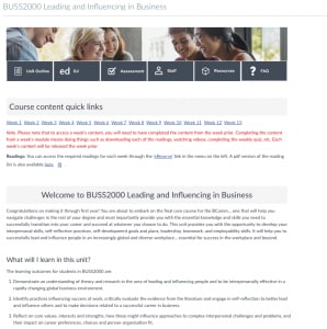 The layout of the home page of the BUSS2000 site provides students with clear links to the content they need at any stage of the course. Online lectures are embedded into weekly modules, with supporting slides, notes and readings providing a well-structured and integrated workflow.
The lecturers really took the time and effort to plan out a great site for the unit. It was very detailed, and the information is easy to find and use!
Key features:
- Online lecture videos replacing face-to-face teaching
- Weekly modules integrating notes, lab prep, quizzes and a To-Do list
- Student survey at the end of each week to track comprehension and graduate qualities
JPNS1611: Japanese 1
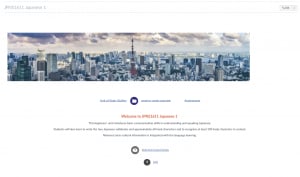
The weekly content in this Canvas site is clearly structured with necessary resources such as scripts, videos, and even Quizlets to help students learn in multiple ways. Resources are structured into pre- and post-lesson tasks to better support blended delivery. Students appreciated the diversity of resources, using rich media for assessment submission and feedback, and having recordings available for follow-up.
The learning material provided, they were very helpful as they come in different forms such as quizzes so I could really test myself.
Key features:
- FAQ page linked to front page to address common questions up-front
- Uses a variety of multimedia purposefully eg. embedded videos within pages model language in use
- Quizlet quizzes embedded into pages for revision tasks
CHEM1111: Chemistry 1A
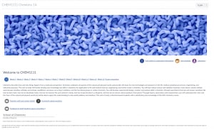
The overwhelming message from students is that the CHEM1111 site was well organised, with a clear and logical navigational structure. Having content presented in an impressive weekly format made it easy for students to locate relevant information such as pre-lecture requirements, tutorial work, lab materials and additional resources.
Everything works seamlessly, all content is properly and effectively integrated into the site.
Key features:
- Pre-lab and pre-lecture resources (quizzes, videos, external urls)
- Weekly mastery quizzes
- Piazza forum for student-to-student interaction and knowledge consolidation
DATA1001: Foundations of Data Science
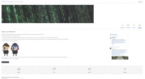 This site engages students by creating a sense of discovery and adventure. Students must complete the introduction module in order to unlock the full site, and continue their learning journey to become a ‘data detective’. The use of social media and custom iconography lends an aesthetic and modern edge to the presentation of course content. The activity-based structure was well received by students who found the information well laid out and easy to access.
Neat layout, clear navigation, aesthetically pleasing and modern design.
Key features:
- Projects using real data to create authentic experiences
- Use of RQuiz for pre-lab preparation, applying the better mark principle
- Compact and professional module design and structure
EDUF1018: Education, Teachers and Teaching
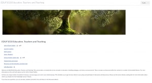
The bonsai banner eases you into a simple but effective frontpage with quick links to important resources. Each week, the resources are integrated into a single page with pre- and post-class activities including videos, readings, and reflective challenges. Students appreciated the straightforward organisation and having easy access to all the necessary resources from one place, and also liked the friendly discussion forums.
It was organised and clear in each section, as well as being updated regularly.
Key features:
- Quick links on home page to important documents
- Consistent weekly structure and design of pages especially the use of headings and icons throughout
- Friendly tone
NURS1001: Health and Human Biology
The frontpage has quick access links to weekly content and staff contacts. Students overwhelmingly appreciated the organisation of the weekly resources, which themselves were infused with a comforting and supportive tone. All resources were available from one module per week, and weekly ‘read me’ pages collected everything that students needed in one friendly place.
The way Lizzy structured the READ ME section and then had the lecture slides, echo recordings, and specific textbook reads was the most helpful and it broke down each part of the unit and made it less overwhelming, more structured and easier to find the content that we needed to access before, during and after the lectures & workshops.
Key features:
- ‘Self care’ prompts in weekly ‘read me’ pages
- Integrated weekly resources for easy access
- Content is signposted well in modules, and naming conventions for file downloads are meaningful and match embedded file download links
INFO3220: Object Oriented Design
 A no-nonsense frontpage leads directly to staff contact details and course content. These resources are separated by activity (lectures and tutorials). While the lecture notes are just file links, students appreciated the tutorial pages which presented integrated resources and in-depth coverage. These were supported by weekly low-stakes summative Canvas quizzes with immediate feedback to help students stay on track – students overwhelmingly appreciated these.
The weekly quizzes conducted through Canvas helped to ensure that I was on top of this unit’s content each week.
Key features:
- Tutorial pages include ‘tip boxes’ to provide instructions for students on how to digest the online content
- Weekly marked quizzes provide instant feedback on progress (quizzes are unavailable in the Open Site)
- Activity-based module design
BUSS1030: Accounting, Business and Society
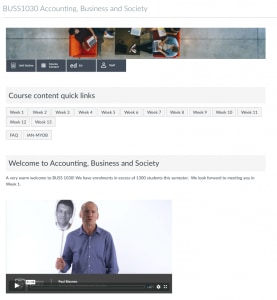
A warm welcome video from the unit coordinator sets the tone for a well-thought out and user-friendly design in this Canvas site. A clear weekly structure ensures ease of navigation through the course material, and the FAQ page proved particularly useful to students with a wealth of information relating to course content, assessments, grades, feedback, MYOB technical support, and additional resources.
The change to Canvas where content is now grouped by week was quite helpful in keeping content together. This was quite useful when it came to revision as the lectures were grouped with tutorial content and tutorial answers by week/topic.
Key features:
- Consistent design approach to weekly pages, all accessed from the homepage
- Use of My Accounting Lab (Pearson) as an additional study resource including weekly quizzes (unavailable in the Open Site)
- Comprehensive FAQ page addressing many common enquiries
ENGG1111: Integrated Engineering 1
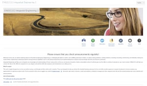
Students appreciated the quick and easy access to relevant weekly information in this Canvas site. Having videos, lecture recordings, notes, and other supporting resources all in one place helped them to stay on track and work through material at their own pace.
The Canvas course for this unit allowed me to access pre-work for my tutorials and watch videos. It also allowed me to submit optional pre-work and find all the links to other useful websites (such as SparkPlus) all in one place.
Key features:
- Student final design project videos are embedded into a page to enable a follow-up peer review task using the unmarked survey tool in Canvas
- Complete weekly pages with resources
- Uses SparkPlus for self and peer assessment tasks
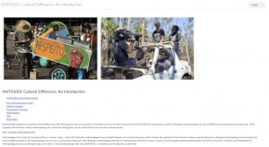
ANTH1001: Cultural Difference: An Introduction
Modules kick off with ‘How university study works’, a page which aims to familiarise first year students with the higher education context and the purpose of lectures and tutorials. Content is structured and scaffolded via instructions, icons, embedded content. Weekly writing tasks enable students to regularly apply what they learn and receive frequent feedback.
Weekly online assessments forced me to read the texts with intent and purpose rather than just skim them.
Key features:
- ‘How university study works’ page familiarises first year students with the higher education context and the purpose of lectures and tutorials
- Content is structured and scaffolded via instructions, icons, embedded content
- Weekly writing tasks enable students to regularly apply what they learn and receive frequent feedback
ECOP1001: Economics as a Social Science
This site makes good use of the Canvas modules and syllabus features to present topic-by-topic resources in an easy-to-access manner. Students also appreciated the organised information around quizzes and assessments.
Everything was very clearly ordered and easy to understand from week 1.
Key features:
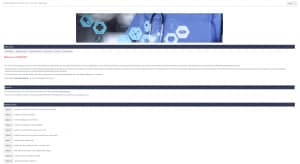
- Makes use of Canvas Syllabus tool as front page
- Welcome message explains the site structure and indicates what students should do next
- Modules structured by assessment and topic
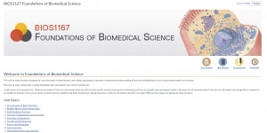
BIOS1167: Foundations of Biomedical Science
The simple yet concise design of the BIOS1167 site drew much praise from students, who appreciated the way content was organised into topics that linked directly from the homepage. Topic pages included notes uploaded pre-lecture, and material from associated prac classes, along with post-lecture activities. The use of mastery quizzes at numerous stages of the course was another welcome feature.
The Mastery Quizzes allowed me to consolidate my learning. The unlimited attempts allowed me to correct and learn from my mistakes.
Key features:
- Clear sign-posting of content areas from homepage
- Post-lecture activities
- Mastery quiz with unlimited attempts after each topic (unavailable in the Open Site)





No Comments