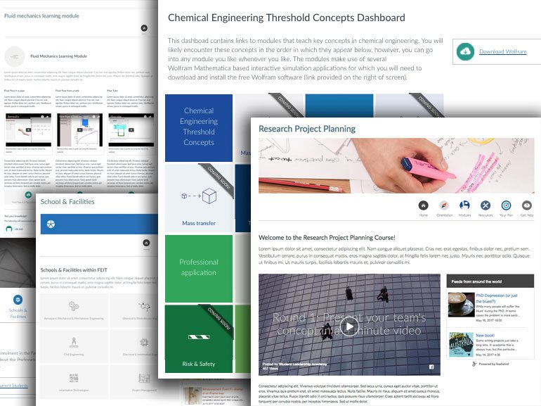
Over the past few months, I have used the University’s new learning management system, Canvas, to build several sites. These include an OLE, a faculty-wide site, and a dashboard. The approach I take to designing sites is situated in graphic design and information design best practice, and as such, the designs are built around user needs and information navigation. Having a love for functional yet aesthetically-pleasing design, I believe well-designed and thoughtfully organised sites can significantly improve learning experiences. So far, I have found Canvas to be supportive of this approach.
When approaching a site design task, I usually start drafting my design on paper, brainstorming how people might want to find information, the paths they might take to find what they’re looking for, and the blocks they might encounter on the way. I then let my sketches guide the development of my site online. This has meant finding interesting ways of using Canvas and 3rd party plugins to best support the design. In this article, I will highlight three of these discoveries – flexboxes, padboxes and Feedwind.
The code I discuss here and other great Canvas resources can be accessed by all staff at: https://canvas.sydney.edu.au/courses/1255
Canvas flexbox
The Canvas Flexbox is based on the popular Flexbox Grid system and can be used to create interesting and responsive web page layouts using relatively simple code. I came to the Flexbox system because the design schematics I was creating either required columns of different types of information (for example, links to content and a news feed in a content area separate from the main body content) or grids (for example, a dashboard). The Canvas Flexbox grid system breaks a webpage up into 12 columns and, by employing a little code, you can dictate how many columns of a page an element flows across depending on the size of the screen it’s viewed on. For example, you can make an element flow across the entire screen of a smartphone yet have it flow across only half the screen on a tablet.
The Flexbox system structures a page into rows and columns. In the Canvas HTML editor, this looks something like this for a two-column layout (on any screen):
<div class="content-box">
  <div class="grid-row">
    <div class="col-xs-6">
       Your content here
    </div>
  </div>
</div>
The “content-box” div class is used to keep elements together and can be used to create space between rows, and the “grid-row” class keeps columns together. But it’s the following column class where things get interesting. The column class code is comprised of two parts; the screen size and a number indicating how many grid columns the element will flow. In the example above, the code means that the div will flow across half of the screen (6 of the 12 columns) on any sized screen (xs = xs and greater unless additional column parameters are added – see the end of the Flexbox section of this article for all screen codes). You can create more accessible, responsive webpages by combining multiple column classes to tell an element to flow across a different number of columns depending on the size of the screen. For example:
<div class="content-box">
  <div class="grid-row">
    <div class="col-xs-12">
      1. Your content here
    </div>
  </div>
  <div class="grid-row">
    <div class="col-xs-12 col-lg-8">
      2. Your content here
    </div>
    <div class="col-xs-12 col-lg-4">
      3. Your content here
    </div>
  </div>
</div>
By using the Flexbox system you can create some striking and responsive pages that present information to your students in interesting and thoughtful ways, regardless of the device they’re using. Below are some examples of designs I’ve created using the Flexbox system and a brief explanation as to what I was trying to achieve.
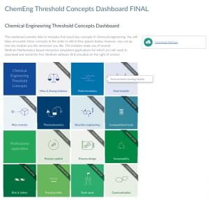
Chemical Engineering Threshold Concepts: Dashboard
The dashboard concept arose from a need to provide students with an easy and inviting way to navigate a series of threshold concepts, while ensuring that they understood the need to download and install some free software first in order to complete the modules. Additionally, the organisation was important as students don’t have to complete the modules in any order, though the topic complexity increases block by block. As such, the arrangement needed to indicate linear progression, but not demand it.
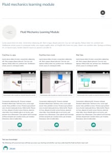
Chemical Engineering Threshold Concepts: An example of a module
Each concept topic is comprised of a number of subtopics. The subtopics don’t have to be completed in any particular order (or at all), though the complexity increases from the first subtopic to the last. As such, I wanted the layout of the page to reflect the complexity increase, while not enforce a linear progression (i.e. as can be achieved through the creation of separate pages embedded in a Canvas module). Each topic culminates in a self-assessment quiz which covers all subtopics. Again, I wanted the layout to indicate this. I also wanted to provide students with an easy way to navigate back to the dashboard home.
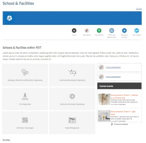
Faculty of Engineering and I.T. Currently Enrolled Student site – Schools & Facilities page
Similar to the Chemical Engineering dashboard, the Schools & Facilities page needed to act as a homepage from which a student could access further information. The page needed to be clear and uncluttered, foster quick scanning for needed materials, and provide easy navigation to other areas of the site.
The Flexbox system can take a little work to get the hang of, but once you do, you’ll have added another tool to your Canvas user-centred design arsenal!
There are 5 screen sizes you can customise your code to:
Code      Screen Size       Pixel width of screen (breakpoint)
 xs       Extra-small       < 576px
 sm       Small             576px
 md       Medium            768px
 lg       Large             992px
 xl       Extra-large       1200px
Pad-box div class
By using the Canvas pad-box div class in combination with a border or a background colour, you can create a highlight box to showcase important information. You could think of the pad-box div class like a highlight box you might see in a textbook. By itself, the pad-box class adds padding around an element. There are four different padding sizes to choose from; mega, normal, mini and micro. The image below shows content in a “pad-box-mini” box that also incorporates a border:

The code for the above pad-box is:
<div class="pad-box-mini border border-trbl">See how other students coped with the task of managing their theses as they share their experiences in these 6 short videos.</div>
I have used this simple but effective code in a number of Canvas sites to highlight key information, create buttons, summarise key messages from topics, and draw attention to additional work students could do or follow up on if interested. Below is an example where I used the pad-box div class and a brief explanation as to what I was trying to achieve.
Research Project Planning OLE: Module page
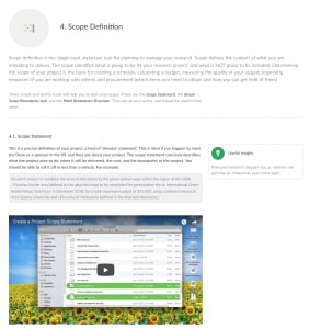
One of the motivations driving the design of the site for the Research Project Planning OLE is that students should be able to revisit the OLE content whenever they need to, to refresh their memory about best practice or get access to planning tools. As such, I felt it might be useful to highlight the key ‘take-away’ information and ideas for each module, and present these separately from the main content area. This would allow students to come back to the resource at a later stage and quickly scan for the main ideas and/or summaries of each module
Feedwind
When designing the ‘Faculty of Engineering and I.T. Currently Enrolled Student’ site in Canvas, I needed to find a way for staff to add news items to the site and for this news to be displayed in a way that would be interesting and engaging to students. Additionally, as several staff would be editing this site, it was vital that this could be achieved relatively easily. Enter Canvas Announcements and Feedwind!
Canvas provides you with the ability to copy an RSS feed link of the Announcements page. This means that any announcement made by staff will automatically be added to the feed, keeping the feed information up-to-date.
After trawling the Canvas Community site for suggestions about how best to embed an RSS feed on a page, I came across the free (to a certain point) RSS feed widget generator, Feedwind. By setting up an account with Feedwind, I was able to create an attractive widget containing the FEIT Currently Enrolled Students Site Announcements feed and embed it on a Canvas page. An added bonus was that I found I was able to create a widget that filtered the posts by keyword, meaning I could create widgets that targeted particular information needs (e.g. job opportunities).
To create a widget, simply copy the RSS code from the announcements page of your Canvas course (or code of any feed you want to display), paste it into the Feed URL box of the widget creator, and customise the widget settings to suit your needs (I recommend setting the width to responsive, and switching the ‘Use HTTPS as thumbnail URLs’ button on). Once you’ve finished customising your widget, click the ‘Save and get Code’ button followed by the ‘Get the iFrame version’ link to get the code you can add to your Canvas page via the HTML editor. Below is an example of a Feedwind widget embedded in a Canvas page.
Research Project Planning OLE
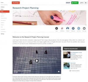
The feed on this Canvas site contains the latest posts from an external blog, The Thesis Whisperer. The Thesis Whisper is an excellent source of information for research students and touches on many aspects of thesis writing beyond the writing process. The inclusion of this feed situates project planning as part of a larger process.
Designing for Canvas
The discoveries highlighted in this article were made trying to meet identified user needs, revealed during the design process of several sites. I’ve found Canvas to be an incredibly flexible platform that supports the design process, particularly in respect to content creation and presentation. I’m looking forward to making more discoveries in the future, and hearing about the discoveries of others.
To continue the conversation, get involved in the Educational Innovation Yammer group.

