During the year 2000, in the height of the dot-com bubble, Steve Krug’s slim and conversational book Don’t Make Me Think burst onto the scene. Neither the first nor the most comprehensive book on web usability, Don’t Make Me Think succeeded where others did not, in that it helped many people (designers, developers, managers and otherwise) think about how real people use websites. Since its publication industries such as User Experience (UX) and the like have flourished in a web and app marketplace that is both saturated and highly competitive.
So how is this relevant for teaching and learning in higher ed? Surely ‘Don’t make me think’ is the antithesis of what higher education is all about. Yes, and no. When Krug says ‘Don’t make me think’, it is less a call to render users unconscious as it is a plea to get users to stop thinking about usage so that they are free to place their attention where it really matters. To rephrase Krug’s pithy title into something infinitely less catchy, we might say: “Don’t make me think about how to use your technology, let me think about the subject instead”. As learning management systems like Canvas allow lecturers to create online sites for learning that look, feel and act like a website, here are our top ten DMMT inspired tips for making sites that are more learner friendly.
1. Think of the student
Generally, when you teach a subject, you usually know more about it than those coming to learn or study it. As lecturers and educators this means that we can have something of an ‘expert blindspot’ when it comes to our own discipline. Added to this, design and computing have long known that when we build or design something we can easily fall into the trap of building something that we like on the assumption that everyone feels the same way. Usability, as its name suggests, means thinking of the user. For higher ed, this user is the student. While you don’t have time to do full-scale user research it is worth knowing who your student is and how they think about your subject, which leads us to point 2…
2. What students know about your subject should shape the site’s architecture
Website architecture is a fancy way of referring to how all the pages of your site are labelled and organised. For example, you may wish to have a separate place for assessments, another for readings, another for weekly lecture content (e.g. Week 1, 2 etc.). Though common, this will not necessarily suit all subjects. Advanced students may find it easier to navigate by the names of theories, tools, computer languages or learning activities (as just a few examples). The decision on how you categorise your content should be based on what your students know about the subject and how they will need use your site during the semester. Some content and activities will be chronological and occur at one point in the semester, other content and activities will not. Reflect on what students grasp (or fail to grasp) in your subject, think about their level of knowledge, abilities, interests. Check out your current analytics to find out which parts of your site and barely visited.

3. Make stuff visible – don’t let your students get lost in the forest
The web, and life in general, is a distracting place – make sure things are visible. Visibility does not mean displaying everything in one place; this can make the user feel lost in a forrest. Equally it does not mean squirrelling everything away in sub-pages; this can bury or hide content and make needlessly complicated pathways for a user to find anything. Make sure that your main navigation is reserved for important and distinct categories of content.
4. First we scan, then we read
We don’t read a website in the same way that we would sit and read a novel – starting at the beginning and proceeding to the end and pausing to reflect along the way. Web interaction happens quickly and in an environment that competes for our attention. When we get to a web-page we skim it, trying to work out what parts are useful and relevant. Instead of working through things in a methodological and repeated manner, we’re more likely to muddle through, skimming and clicking as we go. Once we have found what we are looking for, then we read.

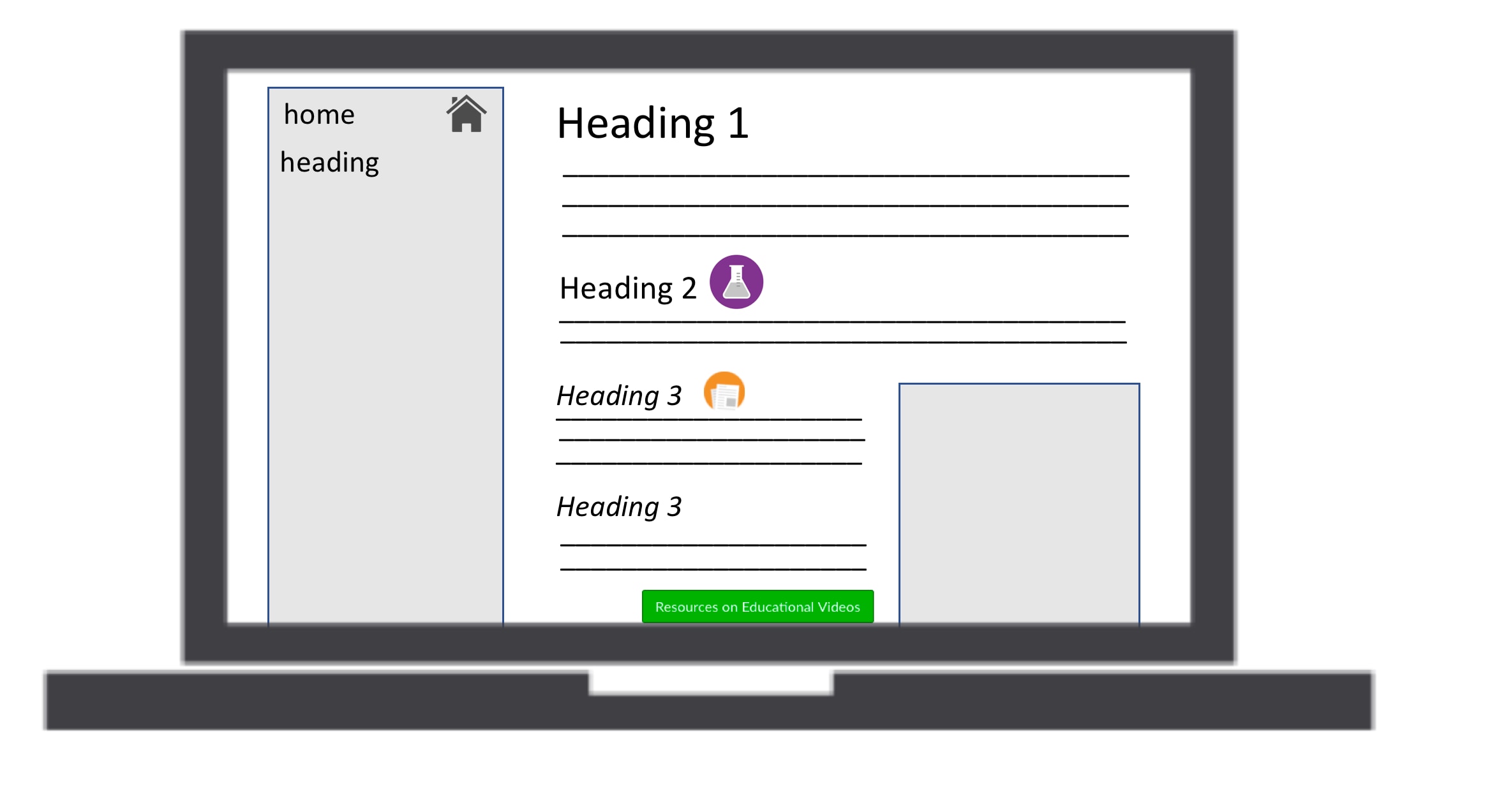
To make it easier for students to scan your site for the content they need at the time they need it (readings, quizzes, revision etc.): create a visual hierarchy using headings and icons that allow the student to quickly discern the point of that page. Icons and buttons, when used consistently, can also help with this.
5. Tell me where I am and show me where to go
It is easy to get lost. Navigation not only helps us find what we are looking for but gives us something to hold on to and tells us what is there. While clicking back is the default browser option for navigating back to where you came from, good navigation should show a student where they are on your site and where they can go. Canvas already has left-hand navigation. However, for better signage, headings, icons, hyperlinks and buttons should be combined with written content so that there is never a dead end. What this means is that students looking at Week 3’s page can easily click somewhere to get to Week 2 or Week 4 (for example). You may even use hyperlinks to create your own home-made tabs or breadcrumbs.
6. “There’s no place like home”
Your homepage is the first place students will land upon whenever they go online for your subject. Think about that. Every time they need to do anything on Canvas for your unit that will be the first place they go and the first thing they see. Your homepage is not only the virtual welcome mat for online parts of your course but premium real estate through which you can talk to students. You can use your homepage to engage and connect students through to the most relevant content. In terms of web usability, users at any point in your website should be able to get back to the home in a single click. Fortunately, in Canvas, you don’t have to worry about this because Home is located right at the top of the left hand course menu – letting students return to your home page whenever they wish.

7. “Can I click it?” – yes you can
Communicate functionality of your site so that students know what they can click on. This point goes back to visibility and letting students know what they can and cannot do. Traditionally hyperlinks (such as this link to google) were blue and underlined when available to click and purple and underlined after having been clicked. Today an assortment of colours are used. Canvas automatically formats links for you. While this is not something you need to worry about, it is worth checking that your own formatting doesn’t inadvertently resemble an already established custom of web formatting. Secondly, for better visibility of important links use some of Canvas’ buttons – which are larger and more clickable than in-text links, whose invitation to click is often perceived to be more optional.
8. Be consistent…
We don’t surf the web quickly if we have to re-learn how each web-page works each time. Consistency and convention are useful tools. Having the navigation remain in the same place stops us from getting lost. Having submit buttons in green, and delete buttons in red uses convention to prevent us making mistakes. Within Canvas most things like fonts and formatting are already taken care of. However, as you customise your pages it is worth considering how you can use the principle of consistency to aid your learners. Maybe on each weekly page readings are always at the top, alternatively maybe content is always organised in sequential 1-2-3 steps.

9. …but allow for the personal and idiosyncratic
Consistency does not mean robotic or slavish conformity. One of the joys of education is that it remains a human conversation between teachers and students. A good eLearning site should extend that conversation and reflect the uniqueness and humanity of both teachers and students. You may wish to have photos of the teaching team, images or colours that reflect your subject, editable wikis and activities that students can be part of. Web 2.0 and user-generated content has thrived from its ability to personalise. We are not automatons and our online spaces should reflect this.
10. Keep the noise down
In personalising your site watch out for visual noise. Steve Krug identifies two kinds of noise: 1) ‘Busy-ness’ and 2) Background noise. The first (Busy-ness) is when everything on the page clamours for attention at once. Think of lots of bright colours, exclamation marks, CAPS, changes in fonts and emoji. This visual noise can resemble shouting. You (hopefully) don’t shout at your students offline, so don’t do it online. The second, background noise, is less overt:”no one source of noise is loud enough to be distracting by itself, but there are a lot of tiny bits of visual noise that wear us down”. If in doubt: Keep it simple.
11. Usability test on the fly
A bonus tip. “If you want a great site, you’ve got to test: after you’ve worked on a site for even a few weeks you can’t see it fresh anymore” (Krug). Today, usability testing is big money and involves everything from eye tracking software through to large sample A/B tests. Educators don’t have time, money or perhaps the ethics clearance to do any of these. Fortunately there are several easy methods you can use to check your own site. First, Canvas allows you to embed things like JotForm at the bottom of each page so that your students can rate and provide feedback. Second, resort to the (computer) age old approach of ‘corridor testing’. Defined as “informal or ad hoc test or solicitation to gain quick user feedback or data”, open your office door and ask a colleague to have a look and tell you what they think.


